
Checkout
Web app
Fintech
Crypto
Checkout is a web app powered by Scalex where users can swap stablecoins (USDC and USDT) to fiat.
For this project, we attempted to redesign the Checkout web app experience to serve users better.
Getting started
The previous Checkout experience worked just fine. It was a very light app and we felt it could be much 'better'. We wanted the user to be able to access the necessary information and perform all necessary actions from one page and it had to be above the fold. This was a unique and fun constraint and we could not wait to get started.
The plan was simple:
The user should be able to input necessary details on one screen.
Minimise the number of scrolls and clicks it will take to perform a transaction.
Ensure the mobile version worked just as well
Have fun.
The redesign
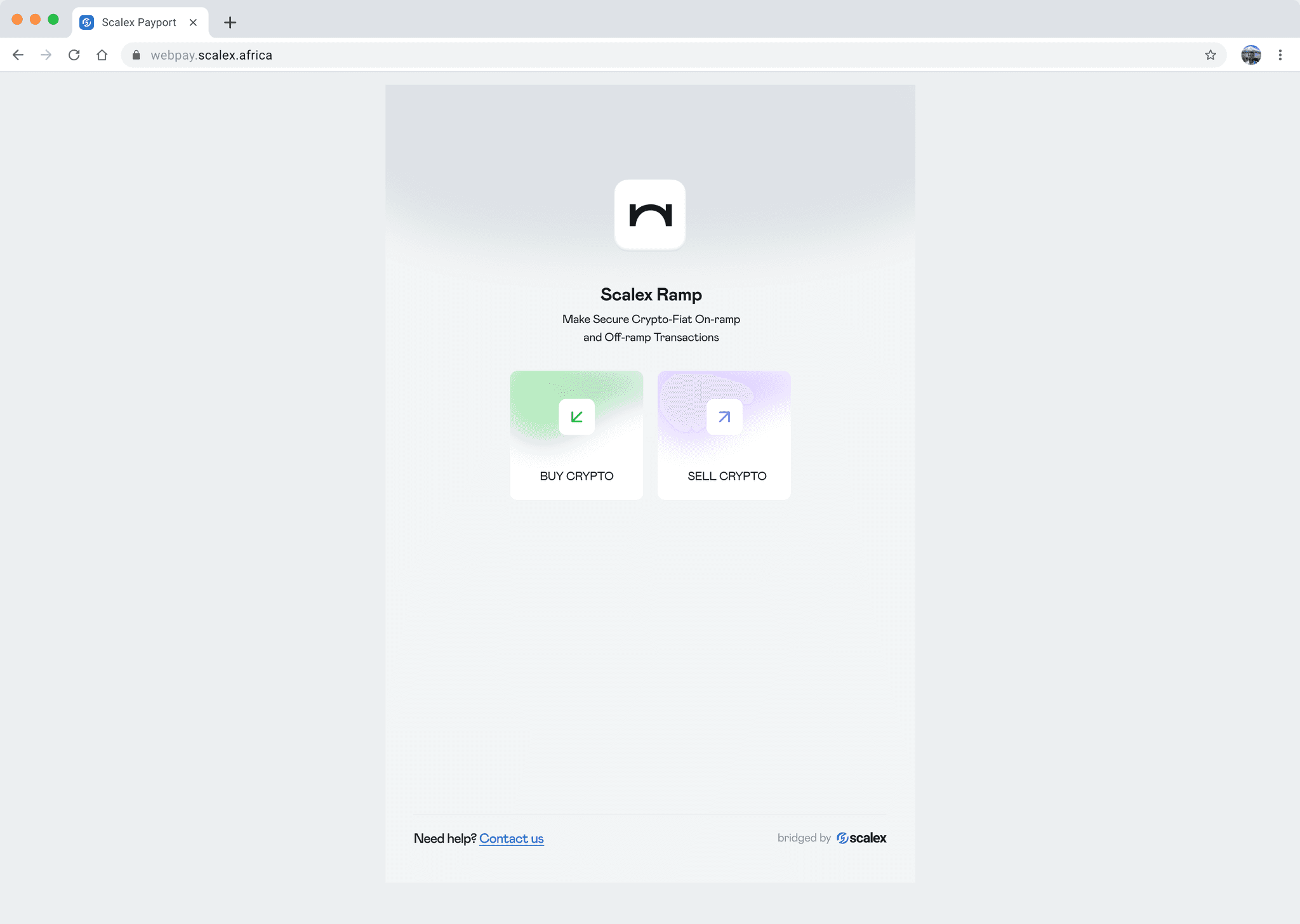
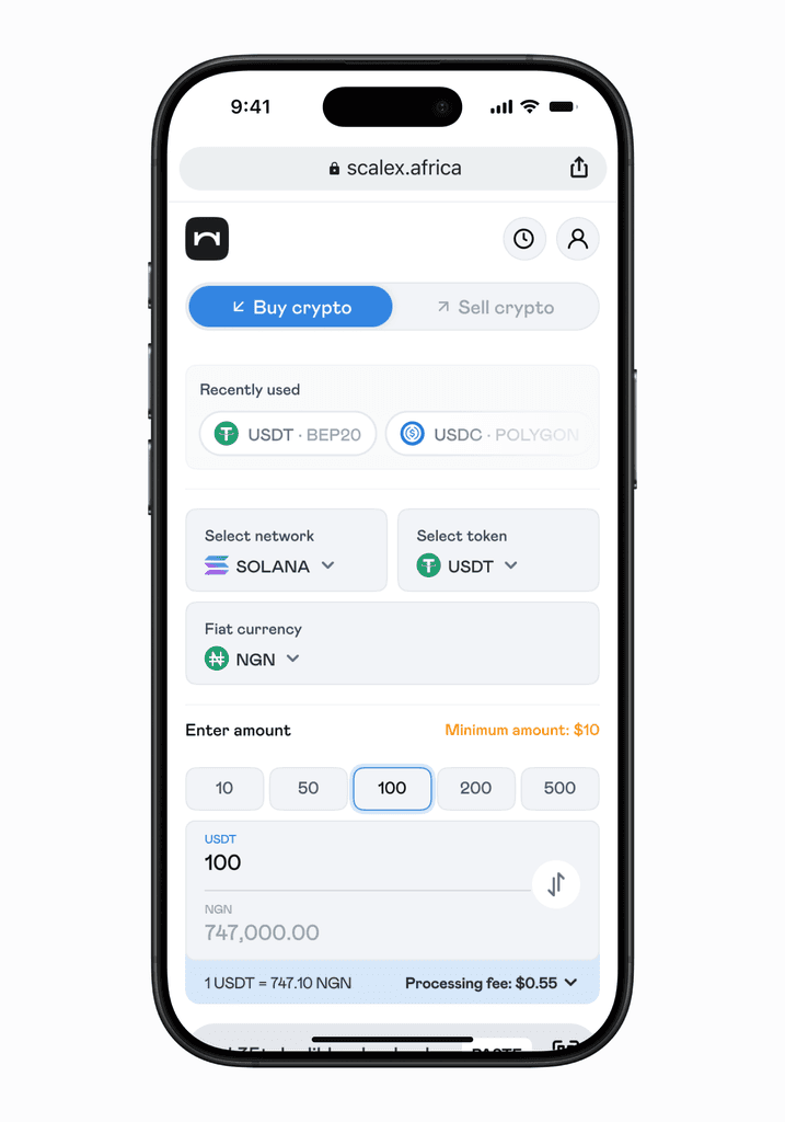
The previous landing page had two options: Buy Crypto and Sell Crypto. Simple and clear. The problem with this is that once the user selects one of these (e.g Buy Crypto) and makes progress, they would have to undo all of that progress if they decided to perform another action instead (e,g Sell Crypto).
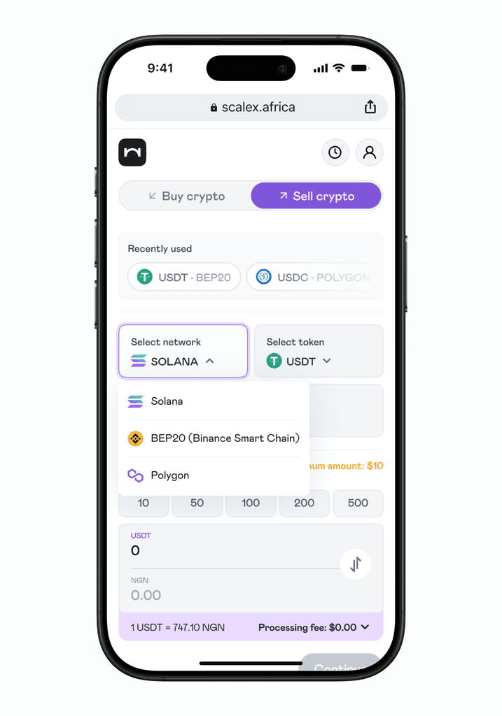
We fixed this by creating a tab at the top of the screen where the user can toggle between both options seamlessly. Swipe to see the before and after.
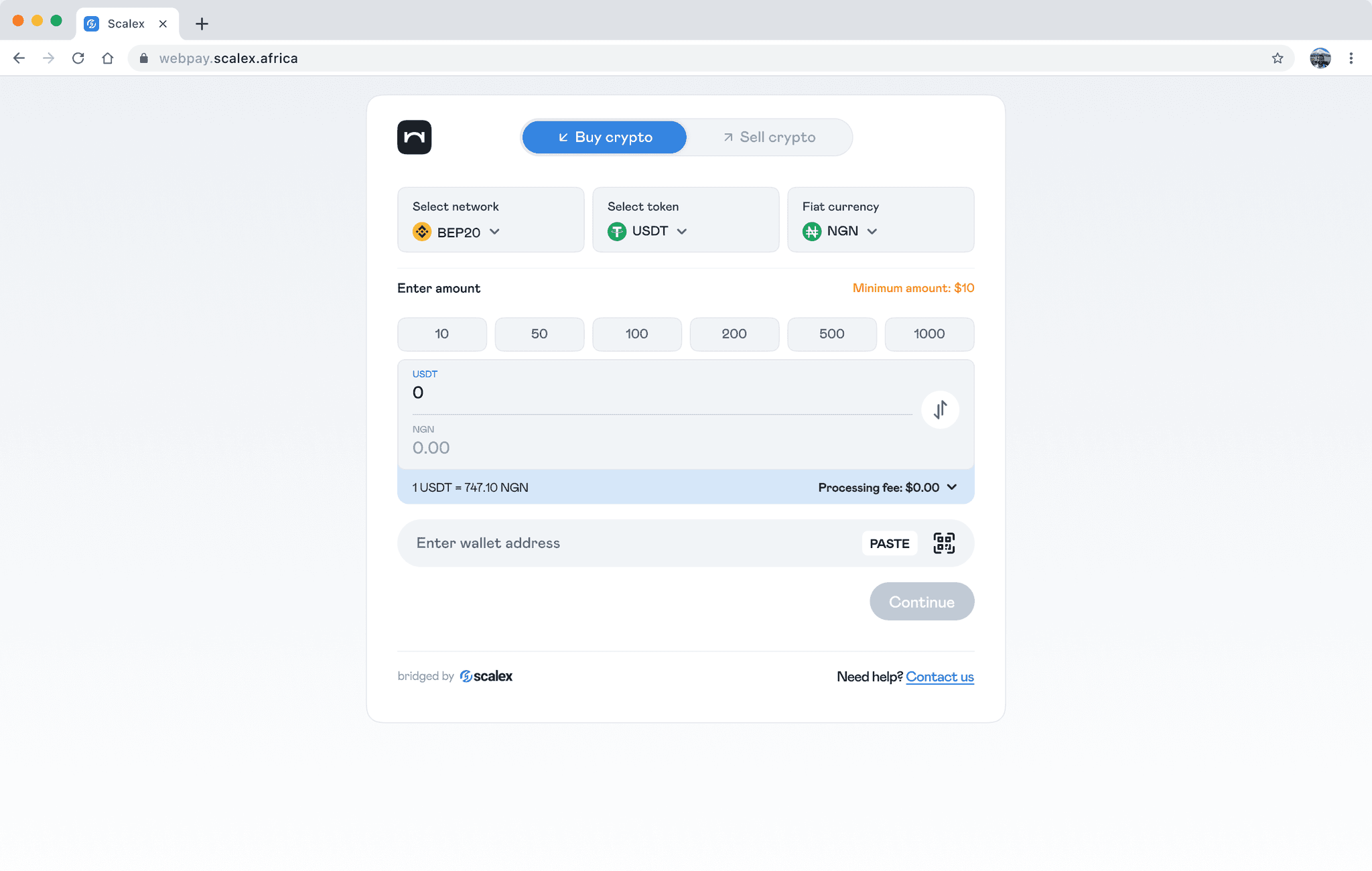
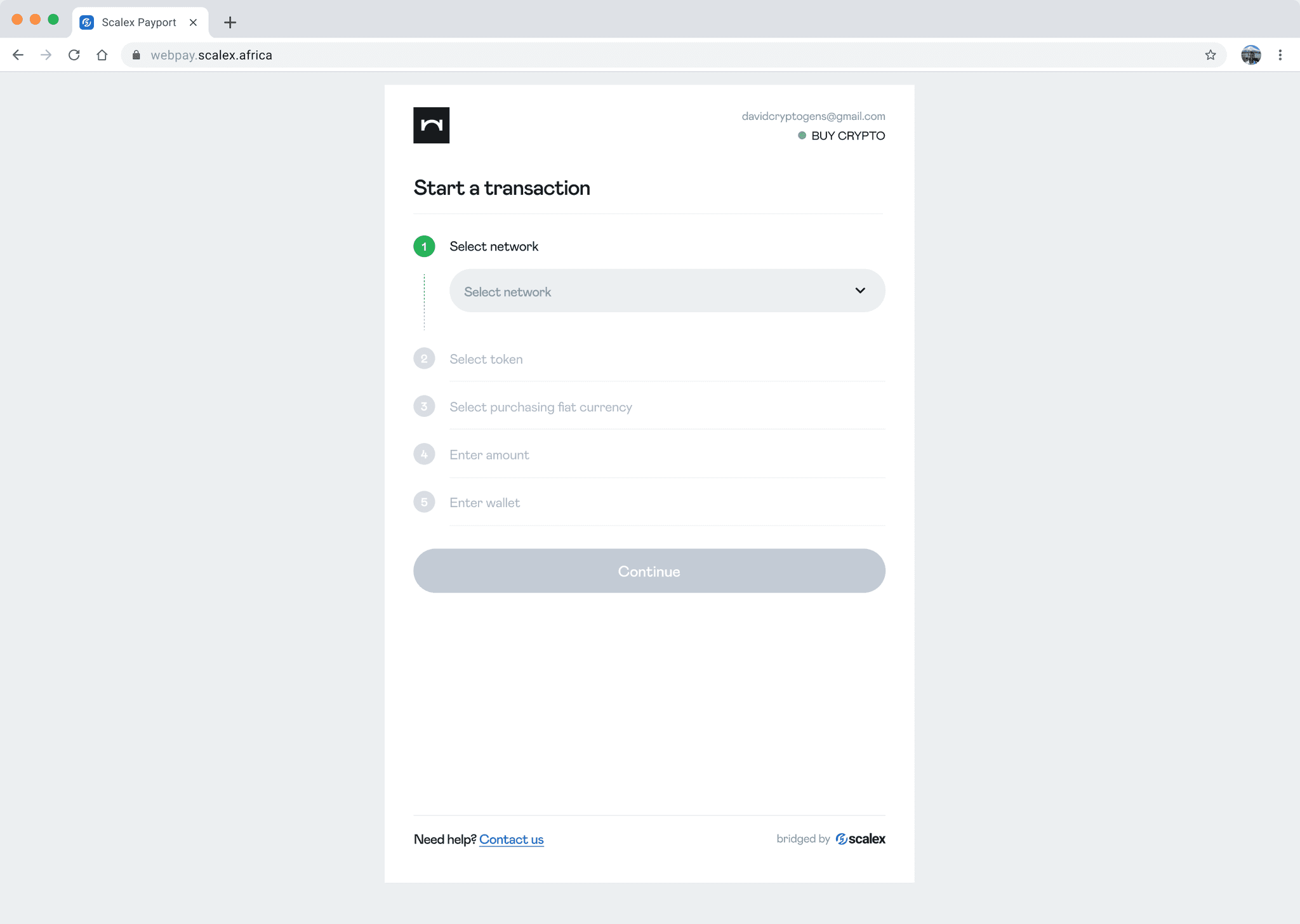
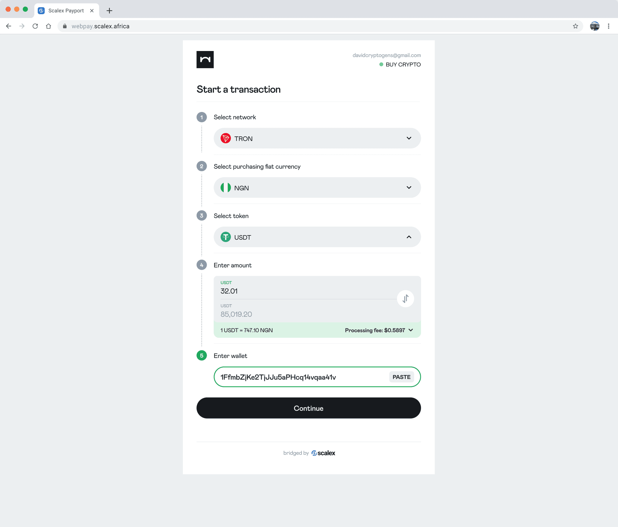
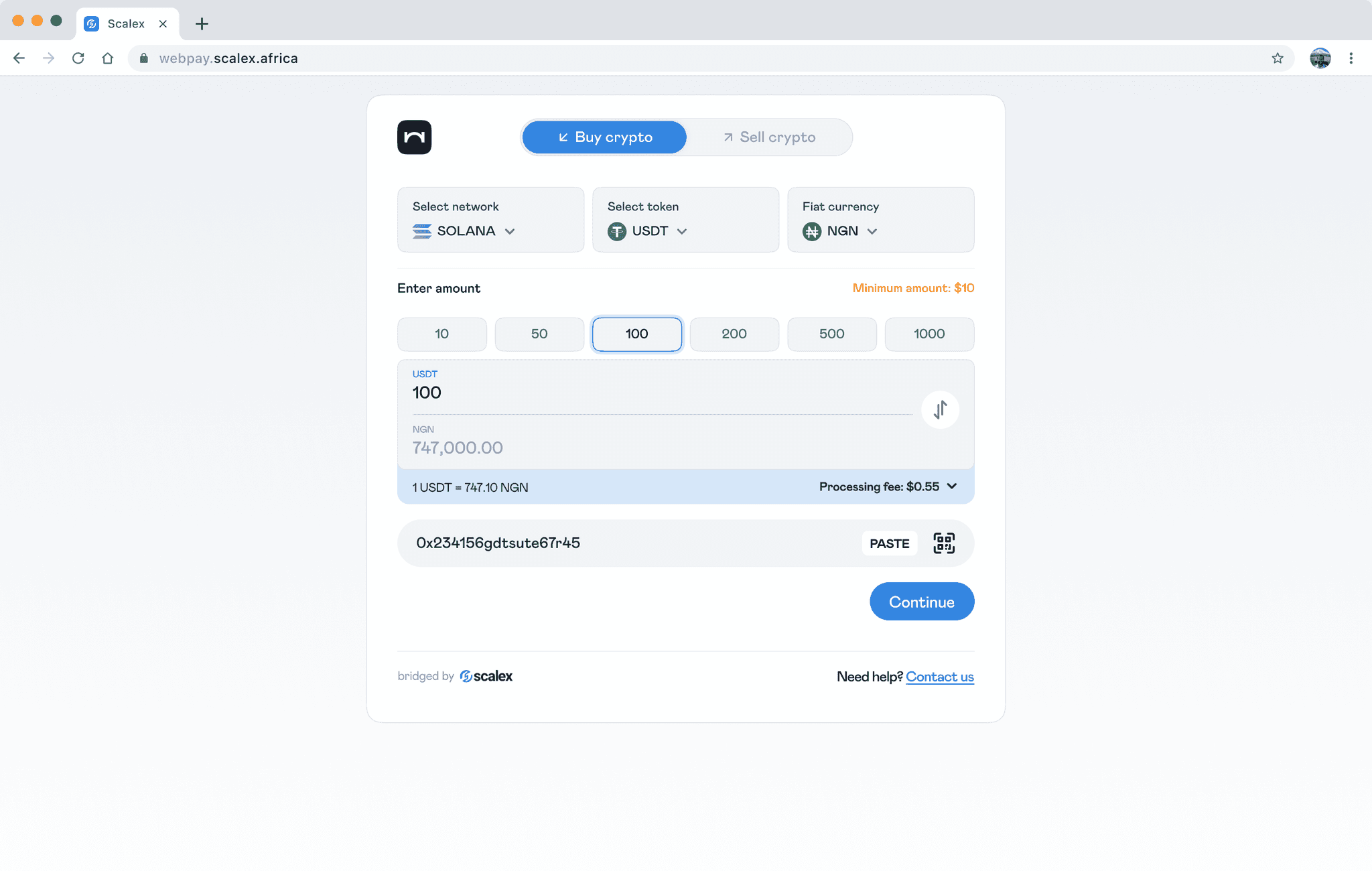
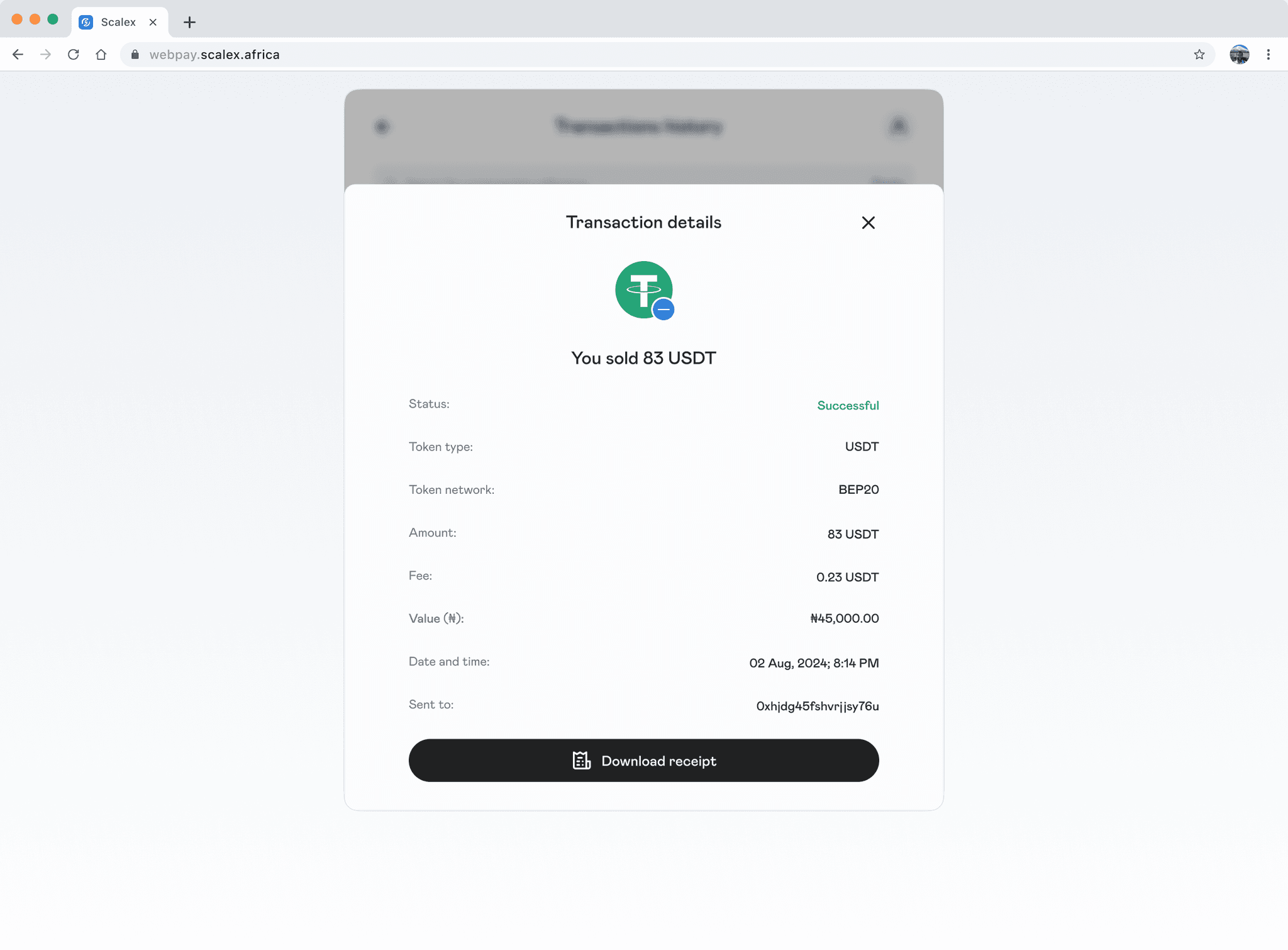
For the transaction page, the user had to follow a sequence of steps. While this was great because it meant there was clarity on what needed to be done at each step, we couldn't help but wonder if another approach was worth testing. So we redesigned the page to include all the information at a glance.
To reduce friction for first time users, Checkout was originally designed to only ask the user to sign in when they have provided information regarding the transaction they want to perform. For the redesign, this allowed us to design a signed in state and bring in new features that did not exist before.
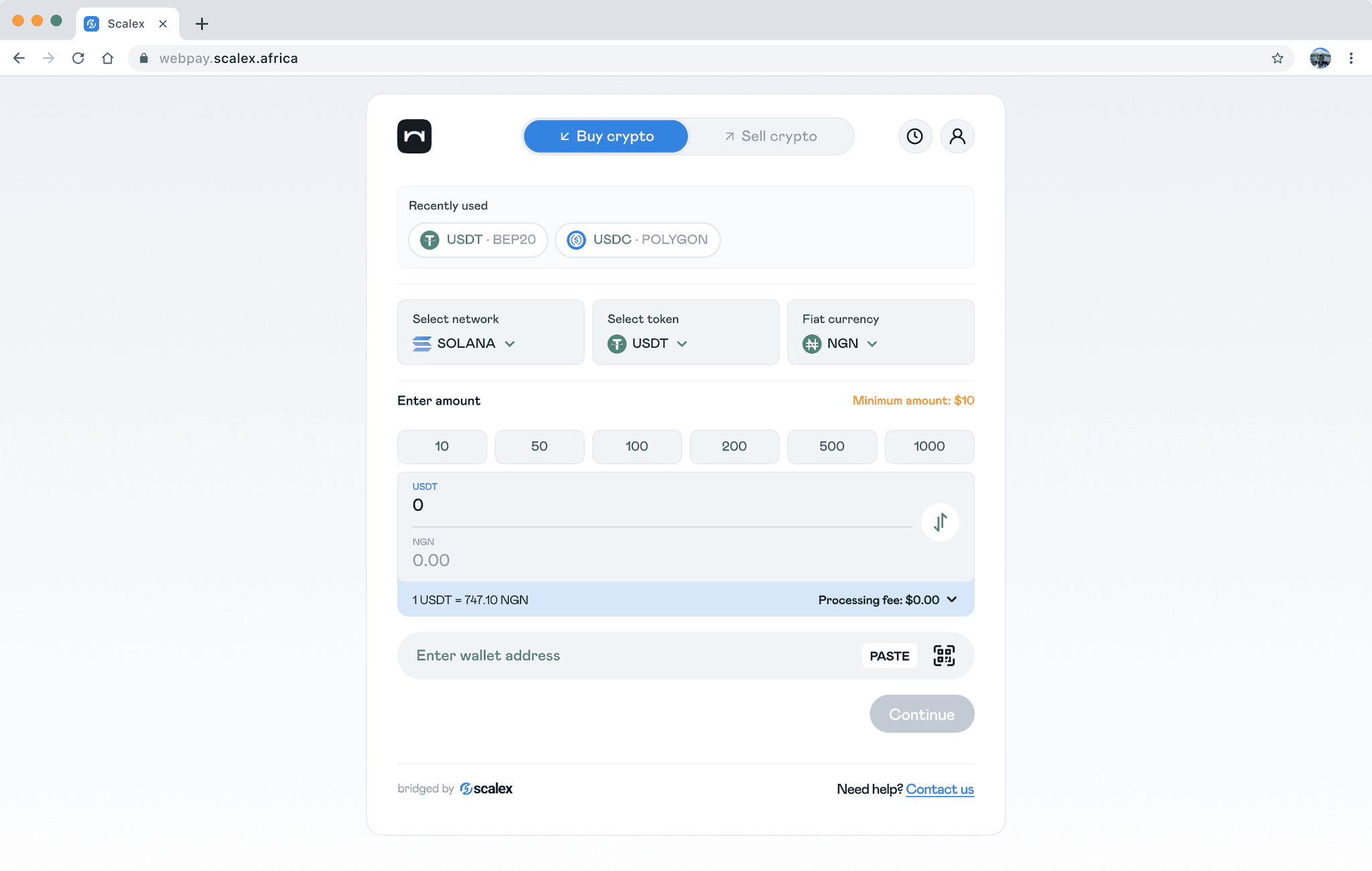
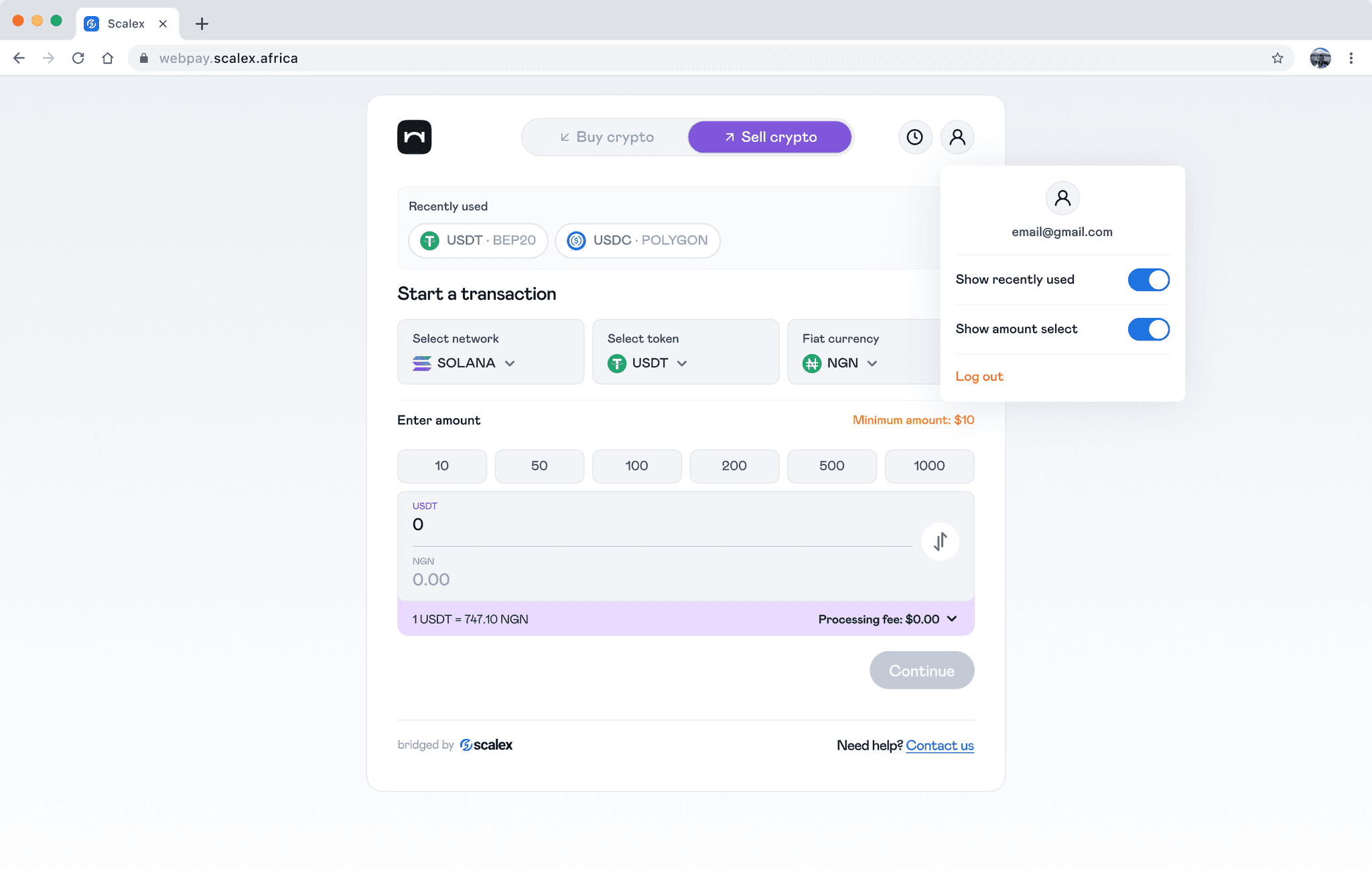
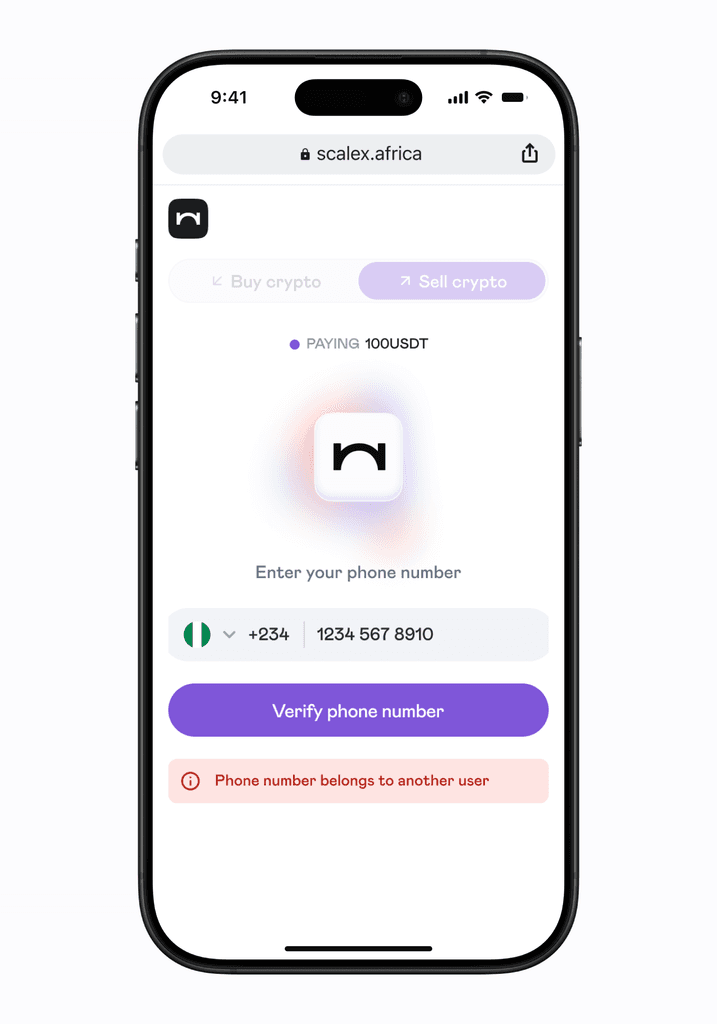
We added some personalisation actions.
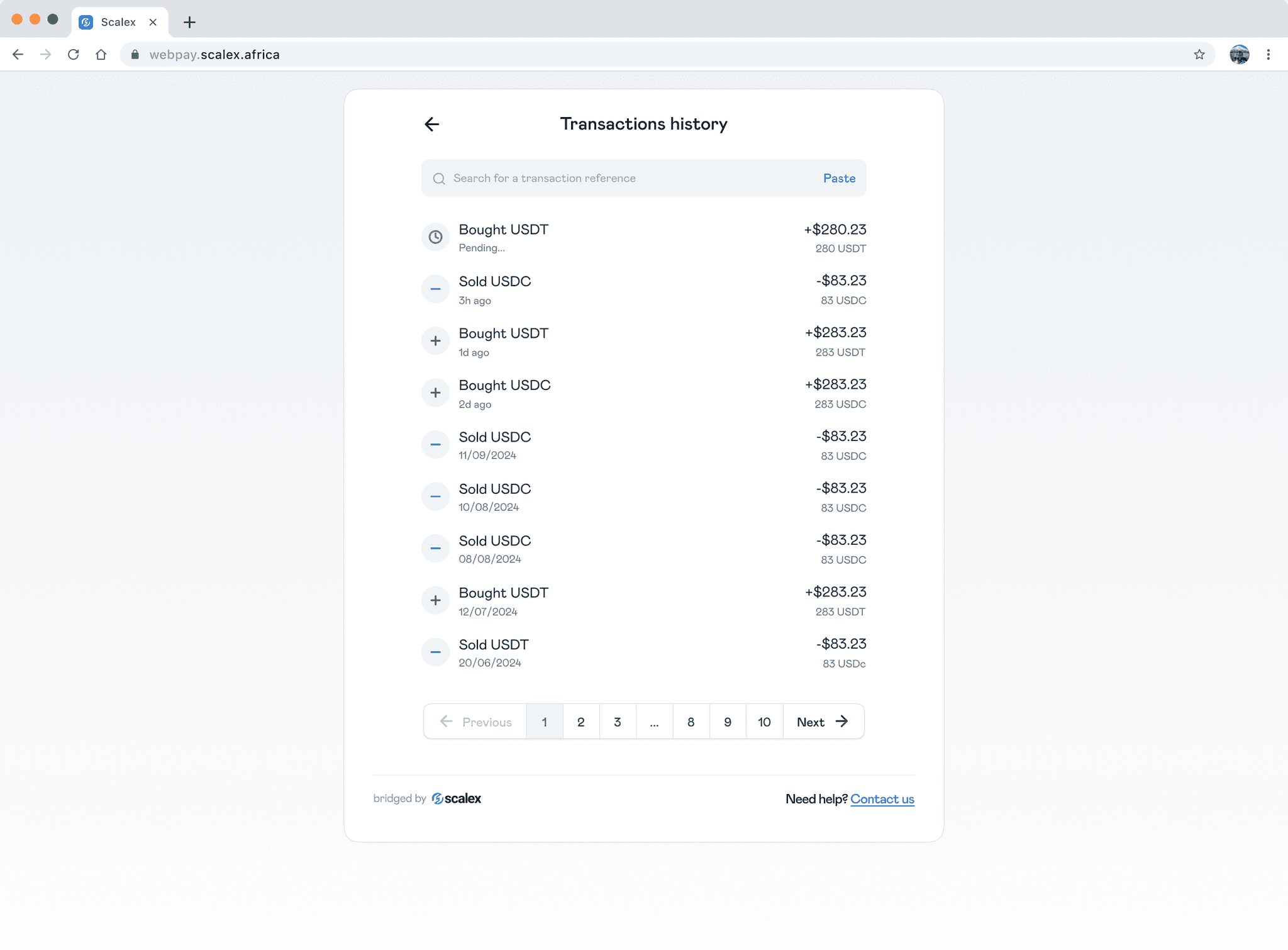
We added transactions history which did not exist before.
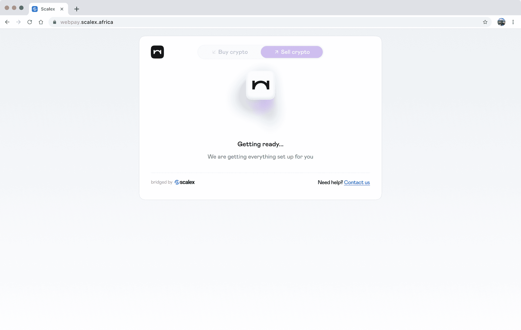
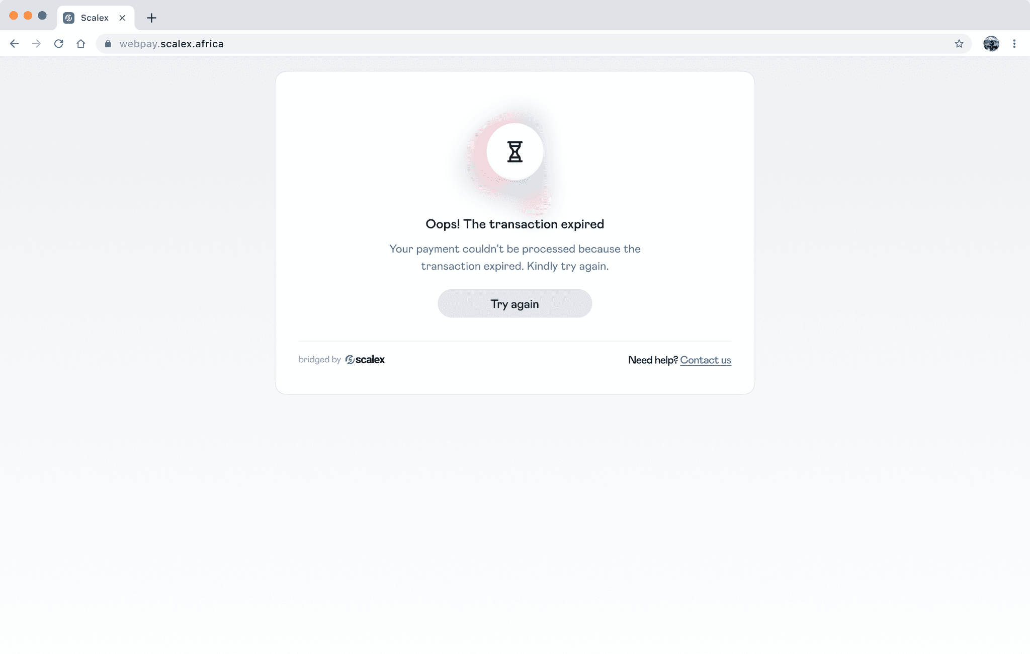
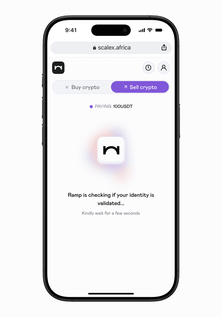
We also designed a few resting/loading states
All screens were designed to be mobile responsive as well.
Conclusion
Unfortunately, we did not get the chance to ship this new version of Checkout before our redesign attempt came to an end. I would have loved to test with users.
Some feedback would have been insightful because I'd started to feel that the UI was somewhat cluttered even though we achieved our goal of having all the information available at a glance and keeping it above the fold. Either way, it was a refreshing attempt at trying something new with the team. The old version is still available to try.