
Scalex
Design system
Mobile app
Website
Fintech
Crypto
Scalex is cryptocurrency company that is building ramp infrastructures to scale businesses, provide secure crypto-fiat transactions and facilitate real-life use cases.
During my time at Scalex as the design lead, I was able to successfully redesign the mobile application to cater to the growing and changing needs of the company. The Scalex mobile app was one of the few consumer facing sides of the business at the time and needed a refresh to serve users better.
While the mobile app got the biggest overhaul, I was also responsible for designing and shipping the new website and a design system to tie all products together.
Getting started
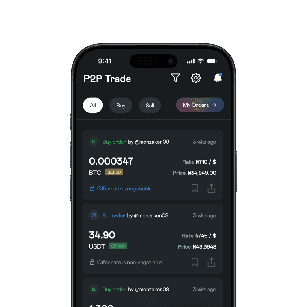
The previous mobile app had features such as Bridge, P2P and One-time funding. There were several blockers with these features:
They were on different tabs and gave the illusion of being seperate wallets.
P2P and Bridge offered the same value. P2P helped users swap crypto to fiat using an agent. Bridge helped users swap crypto to fiat using Scalex.
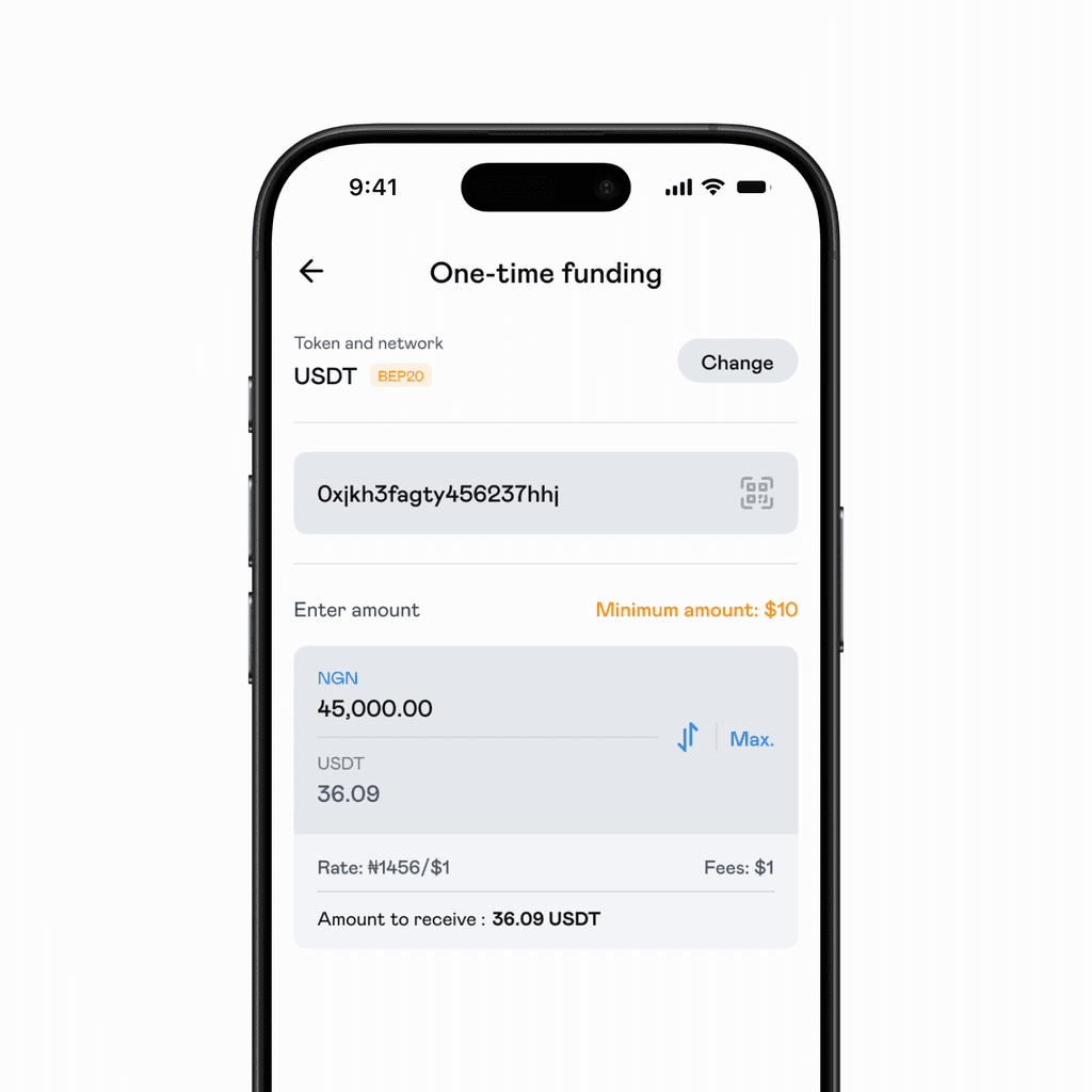
The value behind a feature called 'one-time funding' was not clearly understood.
Action plan
It was obvious what the next steps had to be:
P2P had to go. Not only did it clash with Bridge but they were significant risks associated with P2P agents, delays, etc. that needed to be avoided.
It had to be obvious that everything was running on one wallet and not otherwise. This help the app feel more efficient.
Ensure features are well understood and navigable.
Stay within specified constraints e.g keep the typeface and blue colour.
The redesign
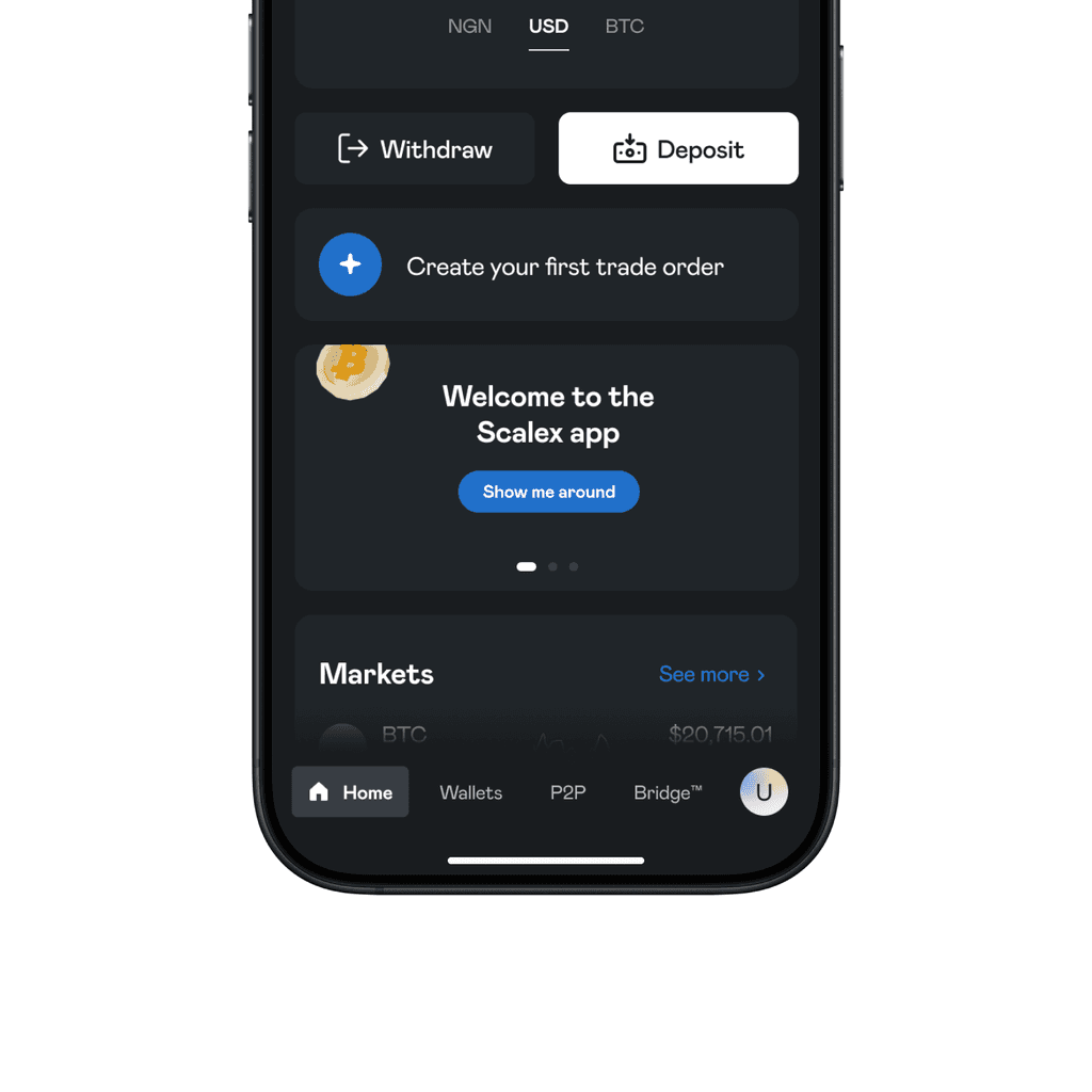
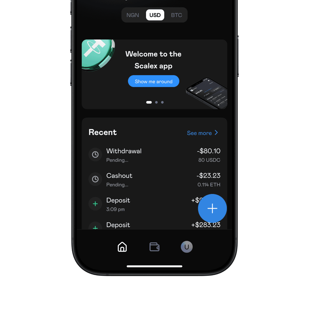
The home page was refreshed with a new bottom navigation that only featured 3 instead of 5 tabs:
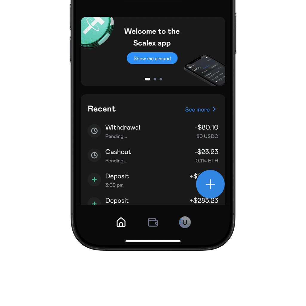
Home - for a general overview of balance, transaction history, etc.
Wallet - for managing tokens, addresses, external wallets, etc.
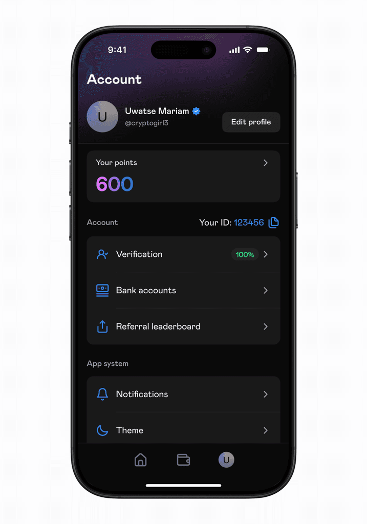
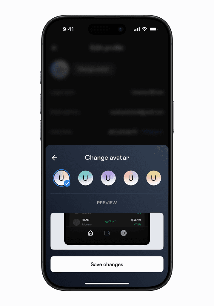
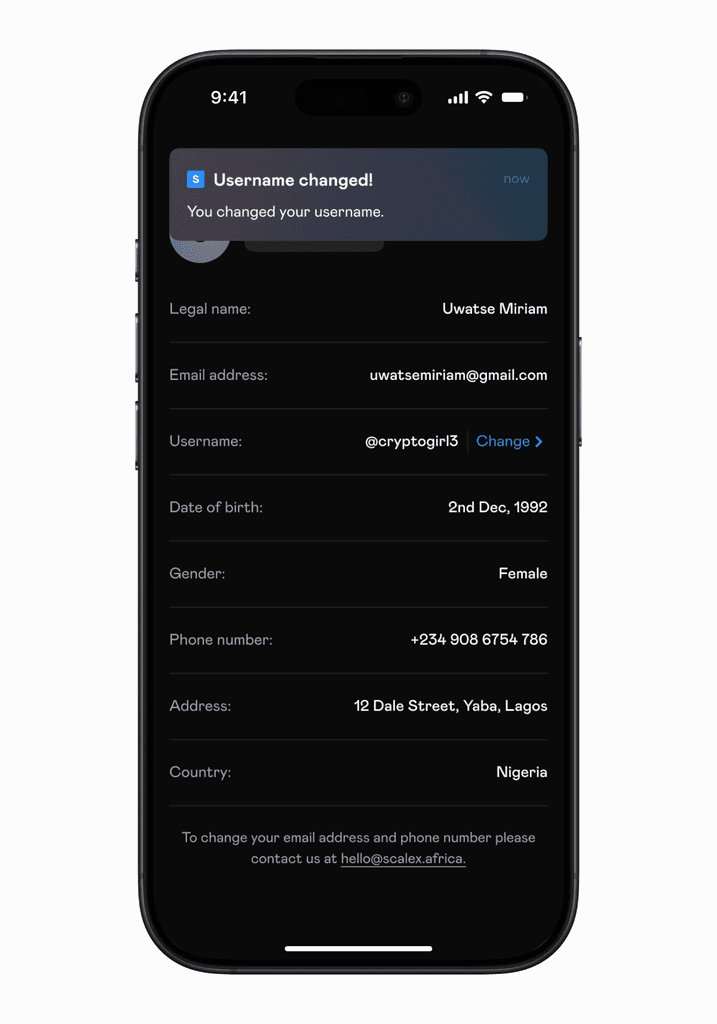
Profile - for managing personal, account, security information and preferences.
Before
After
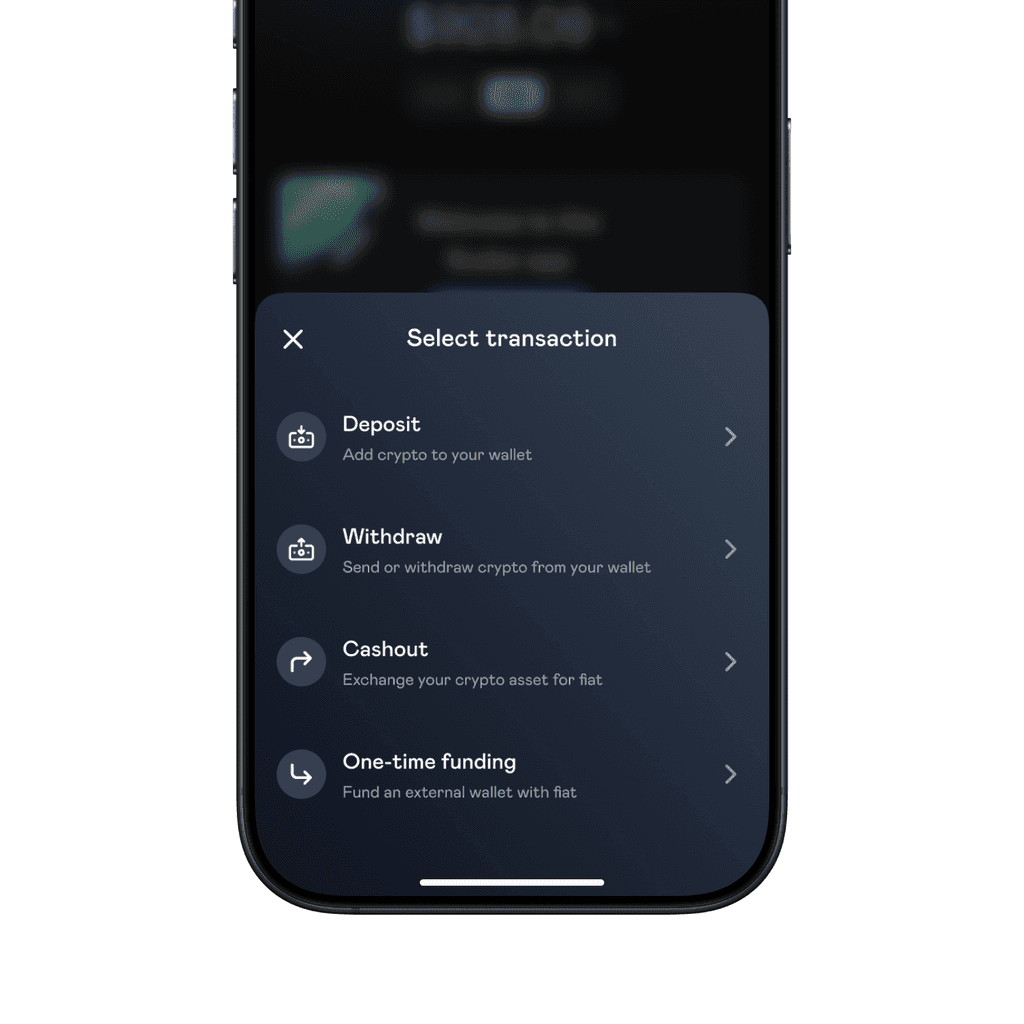
To the bottom right, we added a new button. It served as the central point from which all of Scalex's features could be assessed. When tapped, it opens a menu of clearly defined actions that can be taken by the user.
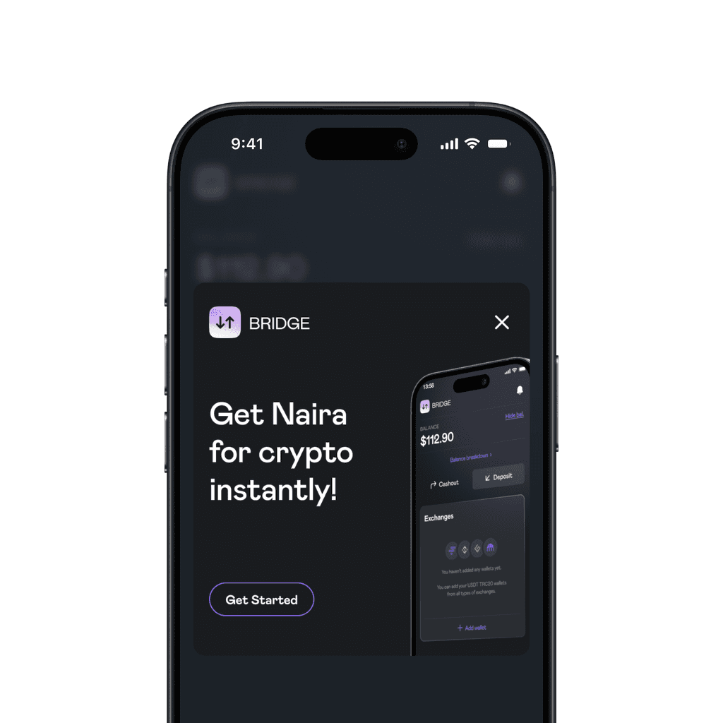
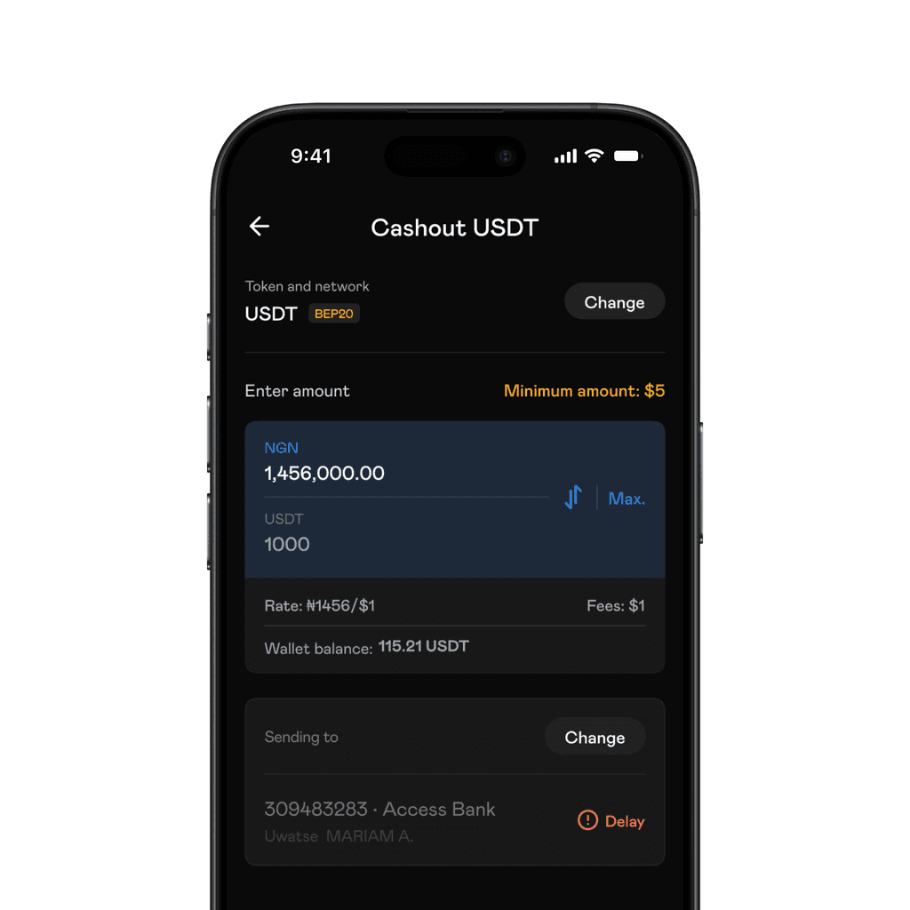
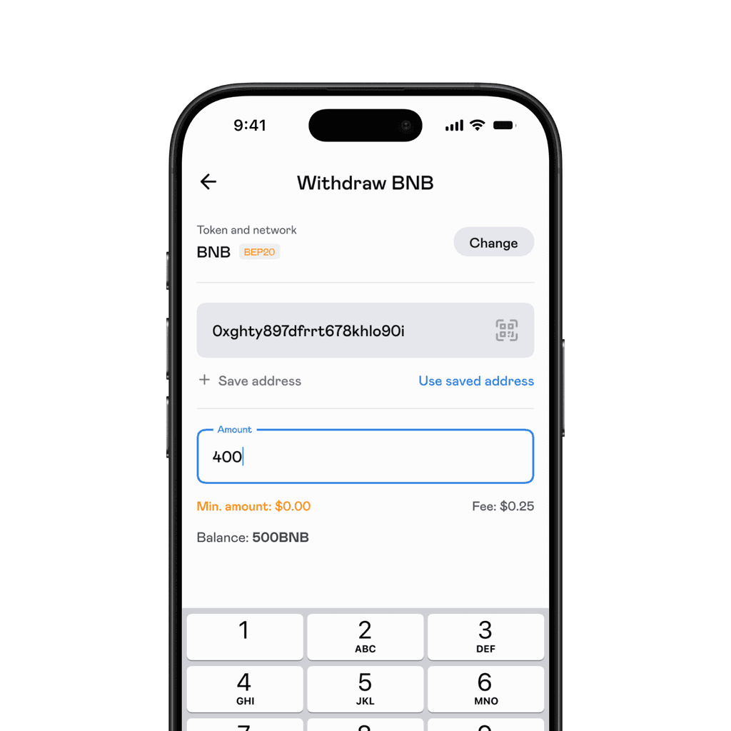
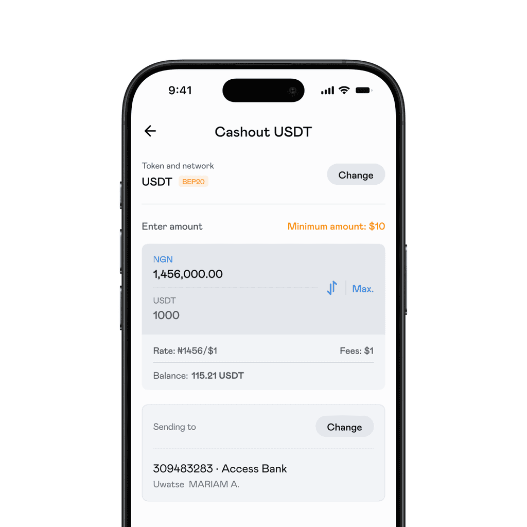
We also changed 'Bridge' to 'Cashout'. This accurately represented the action of swapping crypto to fiat and receiving fiat in your bank account in minutes.
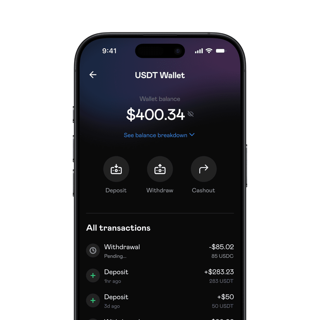
For the wallet screens, we only showed token specific actions to be taken when users tap on a token in their wallet.
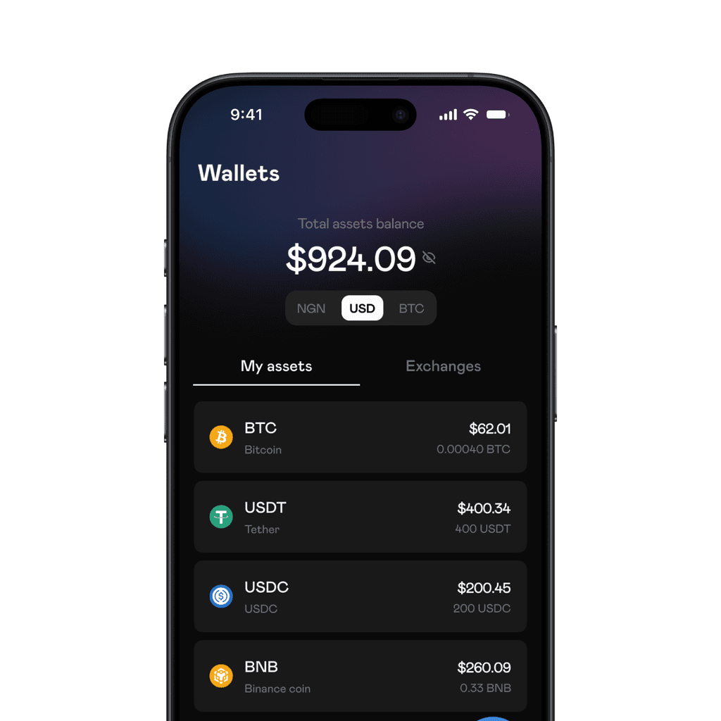
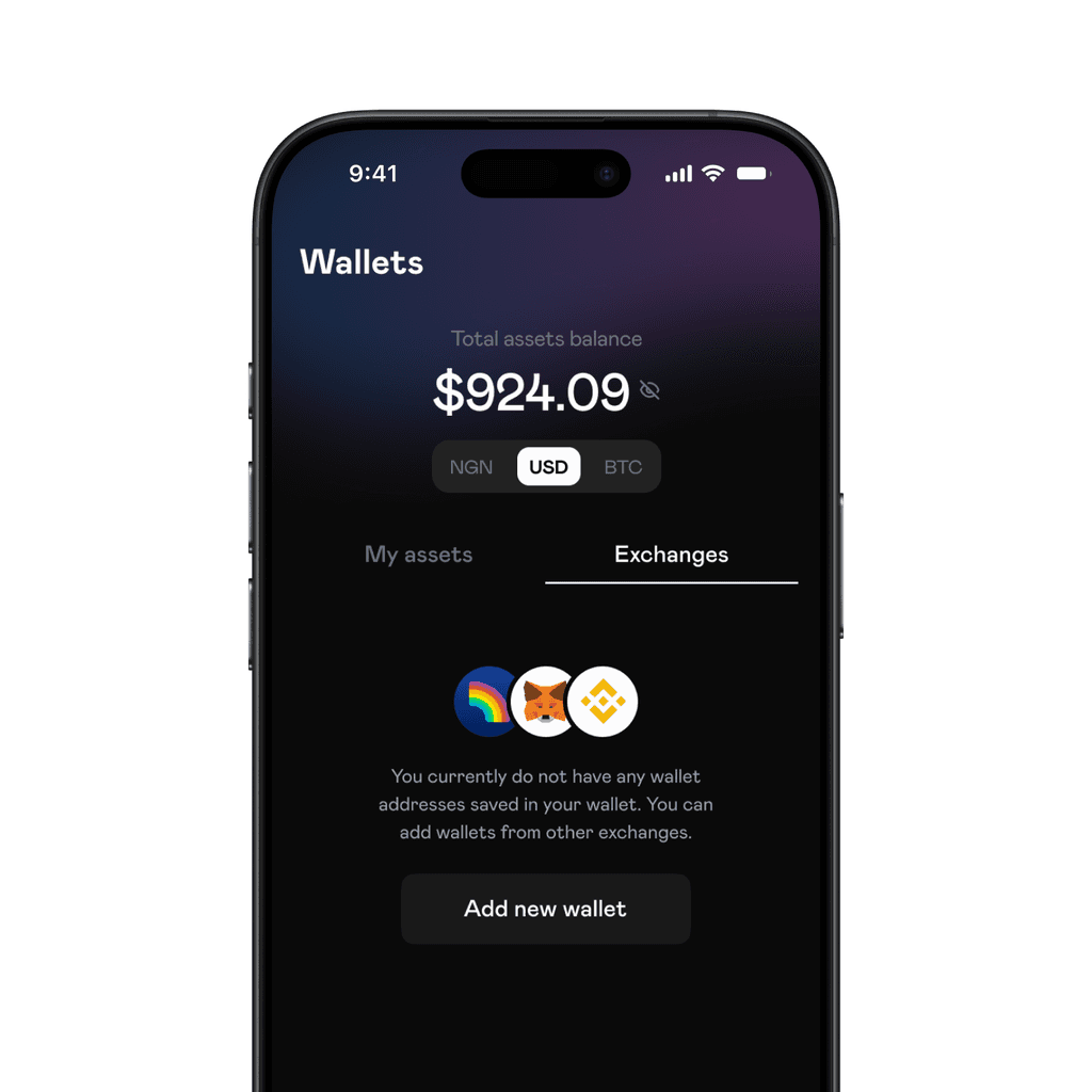
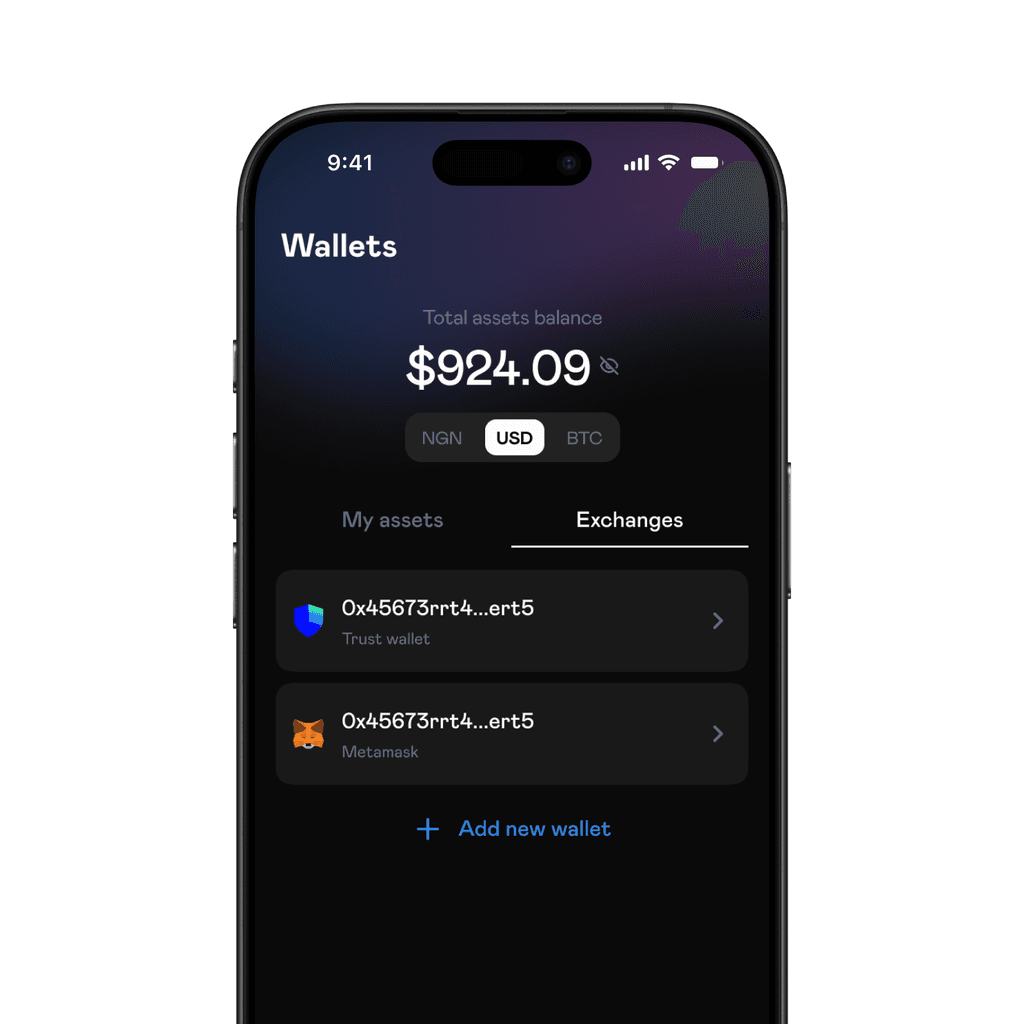
Under wallets, we added an 'exchange' tab for users to add external wallets to their account for quick withdrawals.
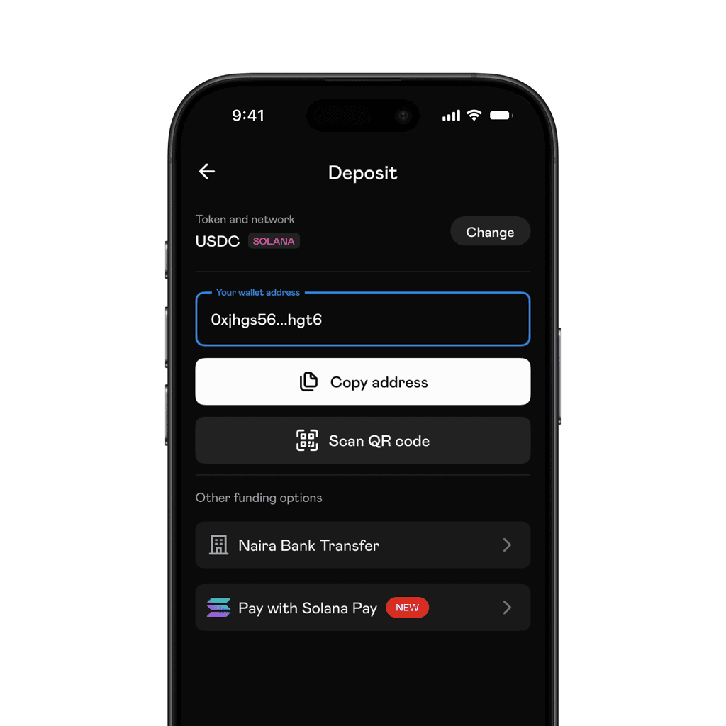
One-time funding got its spotlight. This feature allowed users to fund an external wallet with fiat. Scalex receives the fiat amount from the sender and deposits the crypto equivalent into the receiver's address.
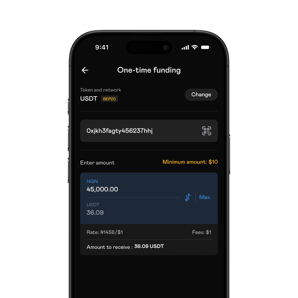
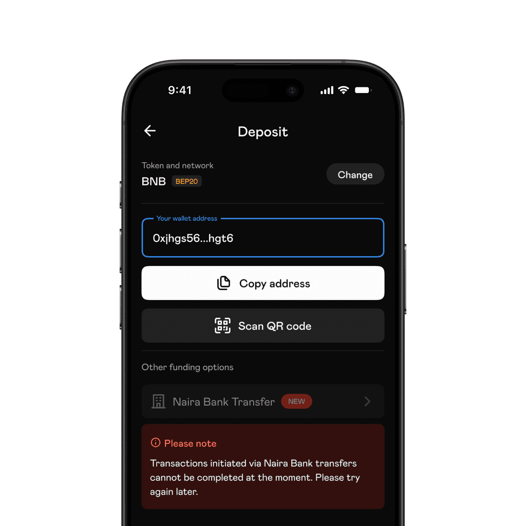
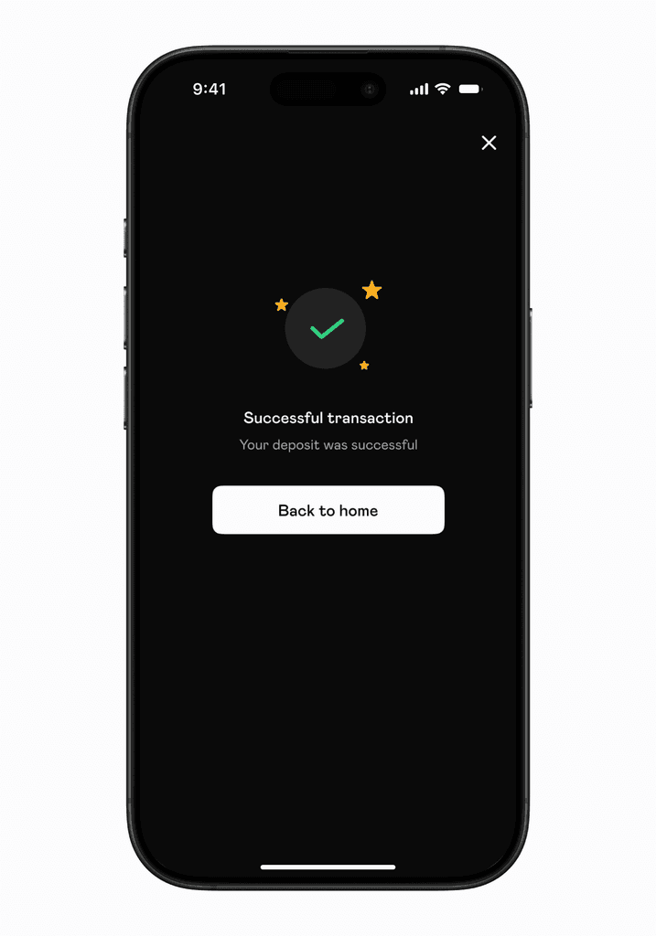
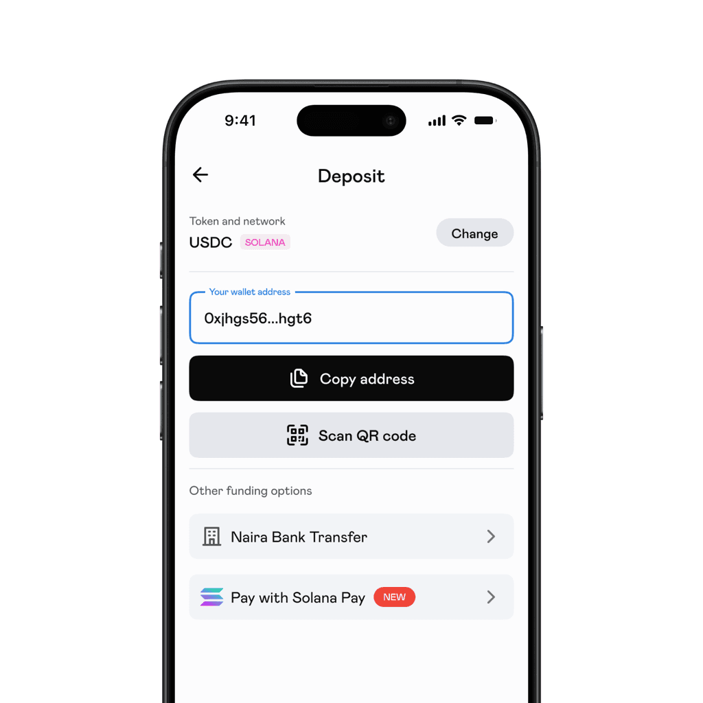
Deposits, Withdrawals, Cashout and One-time funding all followed similar flows:
Select asset
Select network (Deposit ends here by displaying a deposit address)
Enter amount
Input destination address (Withdrawal and One-time funding ends here)
Select bank account (Cashout ends here)
Viola!

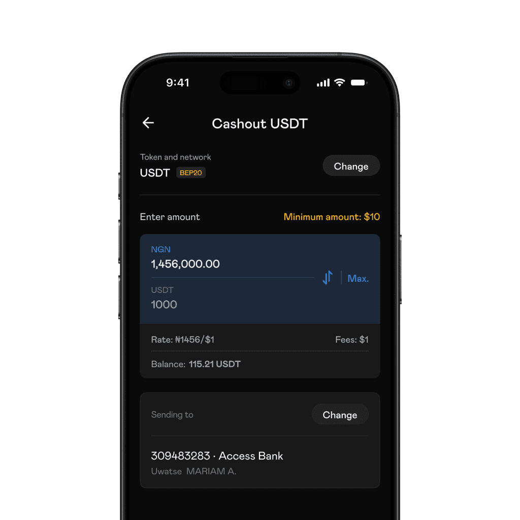
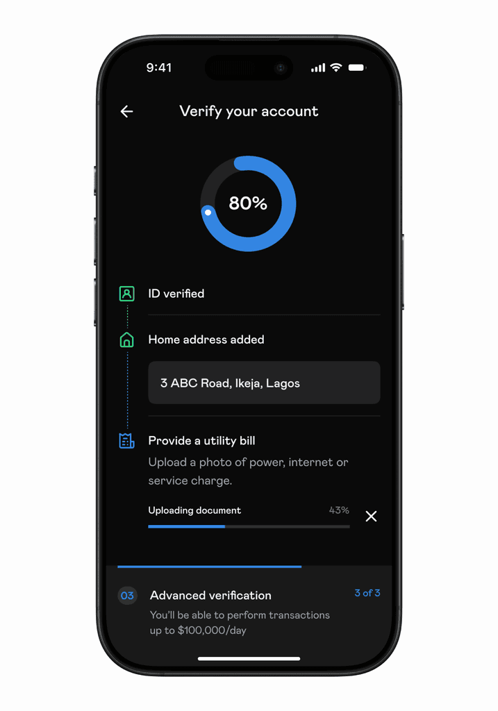
Naira bank transfers allowed users to use make deposits, and fund external wallets with fiat. The conditions for these were not always perfect even when the user was just trying to cashout. To improve the experience, we designed delay states to keep the user informed in cases were transfers would take longer than expected.
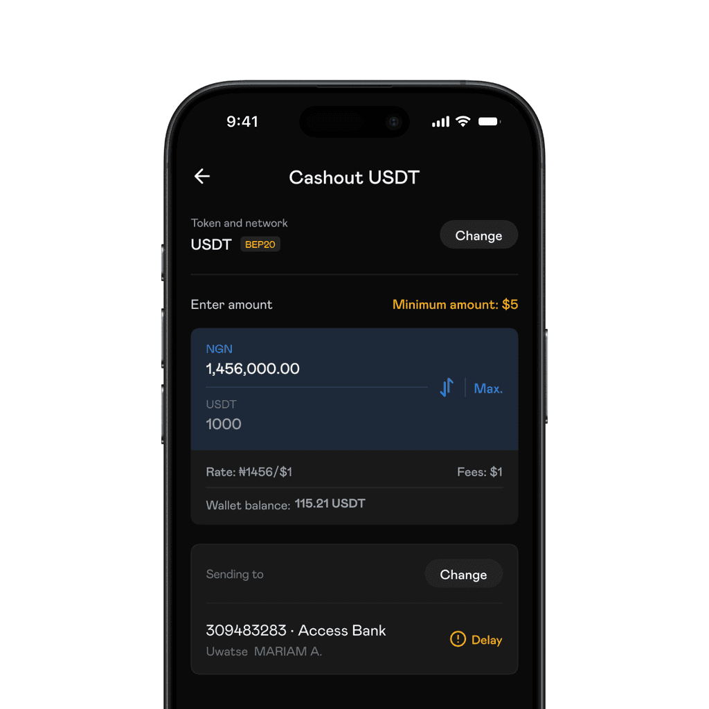
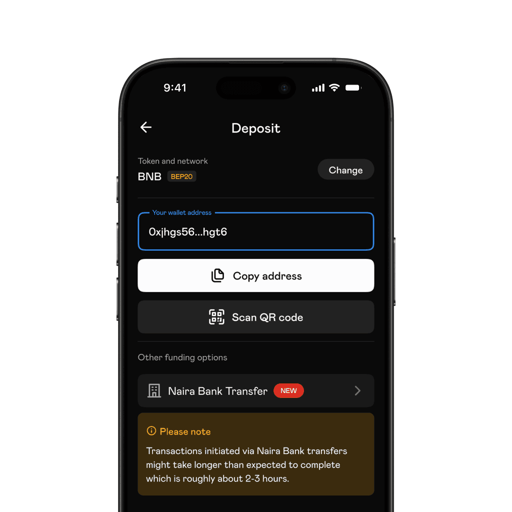
In cases where we could not establish a connection to a bank or estimate delay duration, we designed states to disable Naira bank transfers.
Although it did not ship, we had added a loyalty feature. It was a way to reward users that performed transactions regularly. It included a leaderboard and referral program.
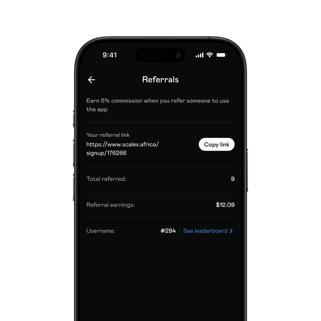
Referral
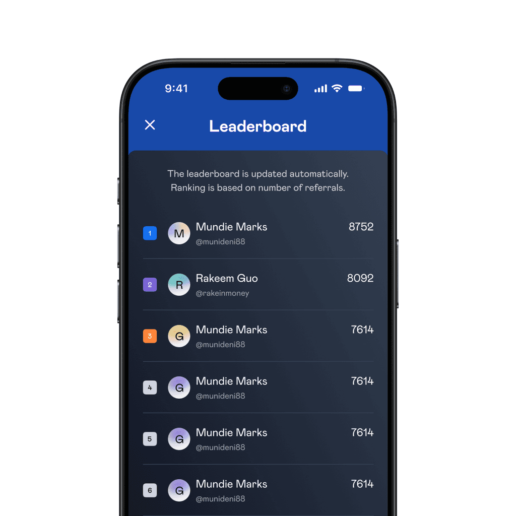
Leaderboard
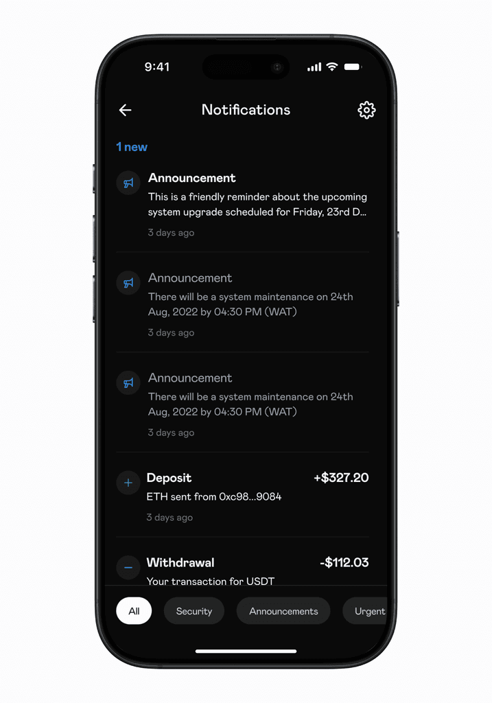
As expected with mobile apps, there were a looooooot of screens. Here's a couple.
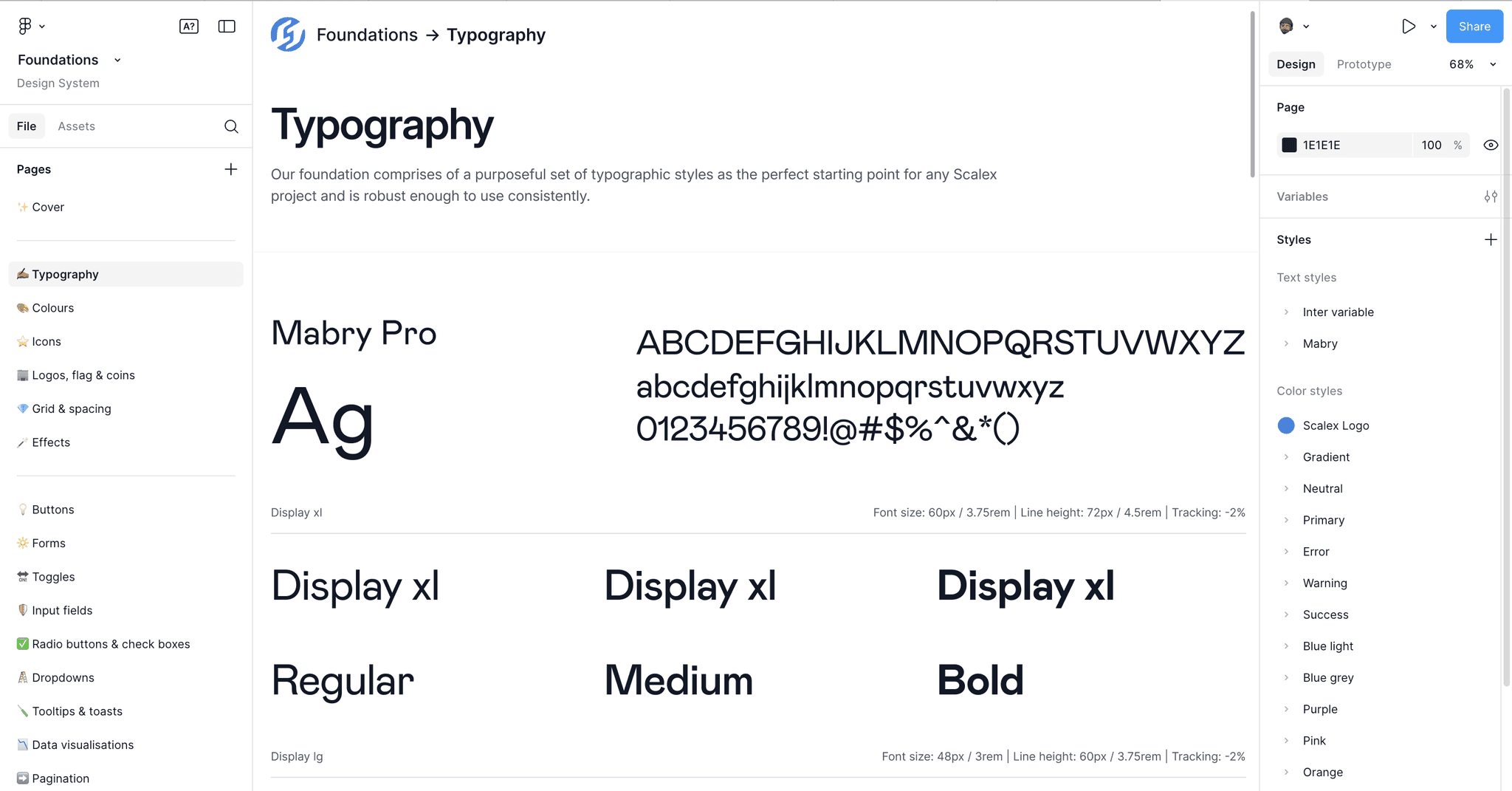
Design system and variables
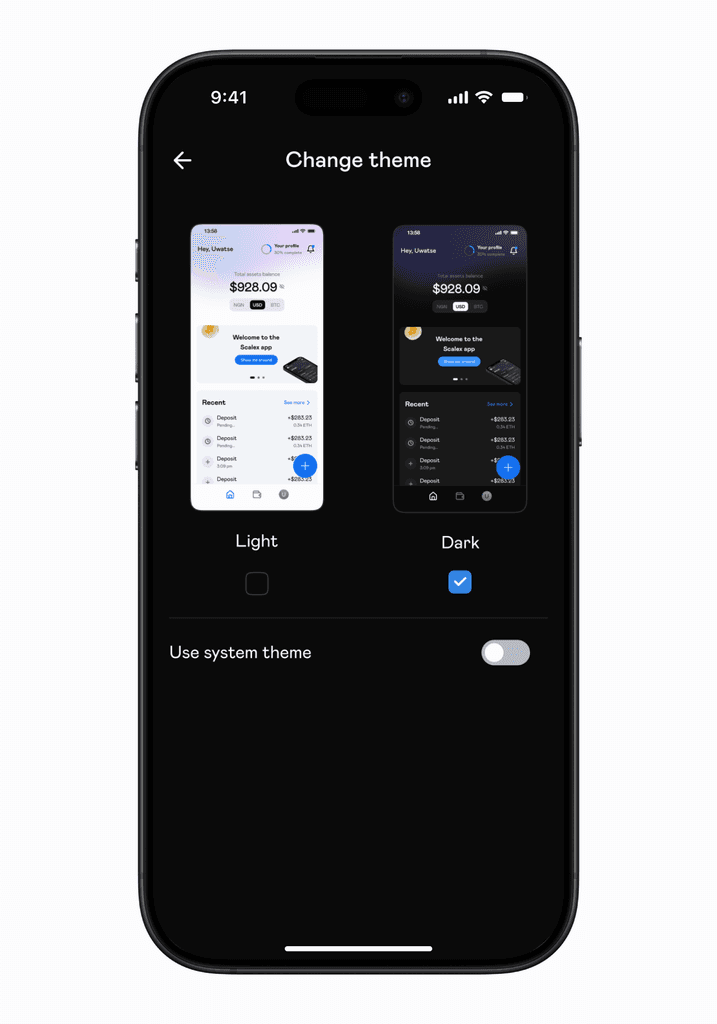
The app was available in light and dark mode. While this was not a redesign (these modes already existed), we designed a variable system that did not exist prior to this. This allowed us to define colours and quickly adapt them to light or dark mode.
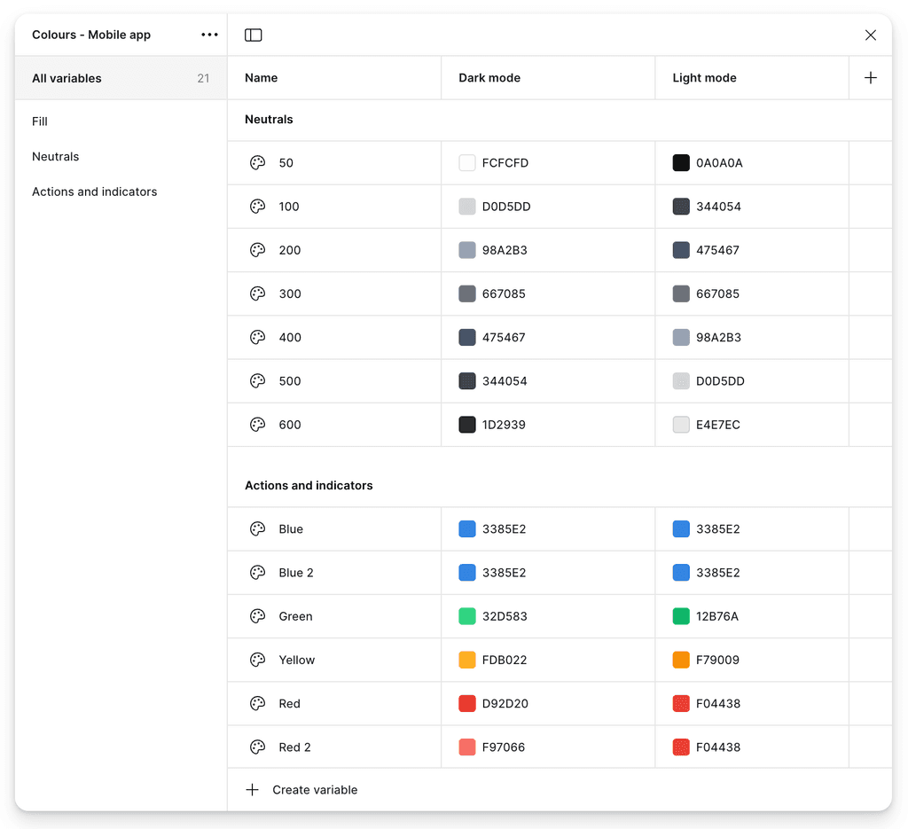
Variables snippet
The variables were part of the company wide design system that served other products besides the app. The design system was updated on a regular basis with more components added as needed.
Design system snippet
The website
The website was redesigned to communicate Scalex's value and highlight all it's features. We designed and built the live website in Framer.
Takeaway
The redesign, variables and design system set ups were definitely fun to execute. The final version of the app shipped and was tested and tweaked constantly.
Although, there are things I would have liked to change e.g icons, spacing, etc. (thanks to the things I have learnt between then and now), I believe the app served its purpose and was much more efficient.
The Scalex app is currently available for download on iOS and Android.